Application Design II - Task 2: Interaction Design Proposal and Planning

Tan Zhao Yi / 0363285
Application Design II / Bachelor of Design (Hons) in Creative Media
Task 2: Interaction Design Proposal and Planning
LIST
Task 2: Interaction Design Proposal and Planning
INSTRUCTION
LECTURE
Lecture 3: Micro-Interaction
Micro-Interaction
- Trigger
- Initiates the micro-interaction.
- User-initiated: Clicking, swiping, tapping, or scrolling.
- System-initiated: Triggered by conditions like custom events, leading to notifications or animations.
- Rules
- Determines the action after a trigger.
- Defines what happens next (e.g., opening an animation, logging out).
- Must be logical to users (e.g., clicking a flashlight icon turns it on).
- Feedback
- Keeps users informed about the process.
- Example: Inline validation during payment (red for errors, green for success).
- Loops and Modes
- Mode: The current setting that remains until changed (e.g., selected project in a time tracker).
- Loop: Defines how long the interaction continues (e.g., time tracking continues until paused).
Some examples of successful
micro-interaction:
1. Checklist Progress Bar

|
| Checklist Progress Bar |
2. Password Error Feedback

|
| Password Error Feedback |
3. Talana Tooltips
Talana uses UI patterns like tooltips, banners, and modals
to communicate with their users. For example, their
contextually triggered tooltips help users discover new
features that they might need at a particular moment.

|
| Talana Tooltips |

It looks like a banner at the bottom of the screen and
contains an animation showing the activity is in progress
and a message, ‘Hold on tight, you’re almost there!’ to
reassure the user.

|
| Main Dashboard Preloader |
6. Dynamic Loading Page


|
| Kontentino's Celebretory Modal |
8. Lock Screen (sign-in process)

|
| RememBear - signing in |

|
| Mailchimp’s celebratory GIF |
10. System Feedback
The Google Assistant's floating dots provide dynamic
visual feedback, indicating the app's status in processing
voice commands. When a user says, "Hey, Google," the dots
begin to bounce, signifying that the assistant is
listening. As the user speaks, these dots transform into
animated sound waves, confirming that the assistant is
actively processing the input. This real-time visual
response enhances user experience by clearly communicating
the app's engagement with voice commands.
11. Tap and Hold effect

|
| Google Assistant Floating Dots |
11. Tap and Hold effect

|
| Facebook Reaction Emoji |
12. Typing...

|
| Bouncing dots that indicates Typing.. |
13. Mouse-over Effect

|
| Hover Effect |

|
| Dribble - Error 404 Page |
Activity
We started our simple animation in Figma. We were
introduced to the bouncy preloader, and the modal.


|
| GSAP |
GSAP (GreenSock Animation Platform) is a powerful
JavaScript library that makes it easy to create animations
on websites. Think of it as a toolbox for making things
move and change smoothly—like text sliding in, images
fading out, or buttons bouncing.
Key Benefits:
- Smooth animations with simple code.
- Highly customizable—animate almost anything.
- Performance-optimized—animations are fast and responsive.
In Week 6, we were given a zip file of HTML and CSS, then
we need to add animation on it.

|
| Animation - JavaScript |
- Logo rotating to its place
- Featured title slides out from left
- Play and Stop music feature
Initially, many of us struggled to successfully animate
the website. However, after several rounds of adjustments
and reviews, I discovered that even minor errors could
lead to significant issues.
Final Outcome: http://127.0.0.1:53224/preview/app/index.html
Task 2: Interaction Design Proposal and
Planning
We are required to develop a
comprehensive interaction design plan for
our final web-based mobile application,
including detailed wireframes, user flow
diagrams, and prototypes of both micro and
macro animations. The goal is to visually
and conceptually prepare the
interaction design and animations that will
enhance the user experience of our
application.
Requirements:
Interaction Design Documents:
Create detailed flowcharts and wireframes that map out the user journey and key interaction points within the application. These documents should clearly illustrate the layout of each screen and the navigation structure of the app.
Animation Prototyping:
Create detailed flowcharts and wireframes that map out the user journey and key interaction points within the application. These documents should clearly illustrate the layout of each screen and the navigation structure of the app.
Animation Prototyping:
- Micro Animations: Prototype small-scale animations that enhance the user's interaction with the application. These might include button effects, hover animations, loading indicators, and feedback messages. Use tools like Figma to create simple animations that demonstrate the intended effects.
- Macro Animations: Develop concepts for larger-scale animations that significantly affect the user interface, such as transitions between different app states or animated introductions. For complex animations, you may use Adobe After Effects or similar tools to create more detailed prototypes. If actual animation creation is not feasible, you may alternatively provide references to existing animations that closely represent your intended design.
- Visual and Written Explanation: Accompany your prototypes with a written explanation or a visual presentation that describes how these animations and interactions contribute to the usability and aesthetic of the application. Discuss the purpose behind each animated element and how it integrates into the overall user experience design.
A. Research
In Week 5 class, Mr.Shamsul asked us to find the
micro and macro animations that we intended to
implement in our final redesigned
application. I searched for some interesting
existing animations in Dribbles for
inspiration.
- Micro Animations
1. Animated Header
The animated header can serve as a
preloader when entering the app. As the
logo / header animation progresses, it visually
represents the app's loading process, enhancing
user experience by providing feedback during
loading.

|
| Fig 1.1. Animated Header |
2. Animated Submenu Icons
Since I have numerous icons, adding animation would
make them more engaging. I plan to animate the icons
in the side menu bar and the tick icon in the
confirmation message to create a more dynamic
experience. Additionally, I will add a hover effect
when user clicks on the button.

|
| Fig 1.2. Animated Submenu Icons |
3. Transaction History
I can animate an overview of transaction history
or spending analysis while user clicked on the
button at the first time, then proceed to the
detail page if they click twice, or create a
button to View Details.

|
| Fig 1.3. Animated Transaction History |
4. To-do Interaction
This animation inspired me to redesign my budgeting
tools into a to-do list format, as I found the
traditional table layout too dull.

|
| Fig 1.4. Original Budgeting Tools |
Now, when users click on items they've paid for,
the text will turn gray and be crossed out,
providing a more interactive and visually engaging
experience.
2. Preloader

|
| Fig 1.5. To-do Interaction |
5. Dashboard
In this animation, the
side navigation bar can be collapsed or
expanded with an arrow, helping to create a
clearer and more organized interface. This feature
allows users to adjust the layout for better
visibility and ease of use.

While user scroll through the stacked cards, the
cards will expand and allow user to choose which
card to view.

|
| Fig 1.7. Credit Card UI Animation |
- Macro-Animation
1. Animated Background and Dissapearing Logo
Upon loading the app, users are directed to the
lock screen, where a subtle background animation
adds visual interest. The preloader disappears
gracefully with a smooth transition animation (as
referenced below), creating a seamless entry into
the app. This combination of animations not only
enhances the app’s visual appeal but also provides
a polished, dynamic user experience.

|
| Fig 1.8. ATIRA: Animation |
This reference inspired me to incorporate a
full-screen animation to keep users engaged while
waiting for content to load. By adding subtle,
dynamic visuals, I aimed to reduce the perception
of waiting time and prevent users from feeling
bored, creating a more immersive and enjoyable
experience during transitions.
3. Loading Components

|
| Fig 1.9. Reading App Animation |
3. Loading Components
For screens with multiple components, I plan to
implement dynamic loading animations to enhance
the user experience. These animations will provide
visual feedback during content loading, helping
users understand that the app is actively
processing their requests.
B. App Flow Map

|
| Fig 1.10. Figma Loading Motion - UI Design |
After the consultation of Task 1, I will continue
working on the redesigned screens only, which
is:
- Login
- Home
- Notifications
- Side Navigation Bar
- Transfer
- Accounts
An app flow map visually organizes and outlines
the user’s journey through the app, starting
from main entry points like the login screen and
branching into core sections, such as
Notifications, Account Management, and Fund
Transfer. It provides a clear sequence for each
path, showing how users navigate from one
feature to another with actions like taps or
slides.
By mapping these flows, I can identify and
optimize navigation paths to ensure a smooth,
intuitive experience, minimizing unnecessary
steps and aligning with the app’s goal of
providing logical, accessible functionality.
This blueprint helps in creating a cohesive
design that aligns with both user needs and
brand objectives.
Fig 2.1. App Flow Map
C. Lockscreen > Login

|
| Fig 3.1. Lockscreen > Login |
- Micro-animation
Fig 2.1. shows the newest redesigned version of
lock screen and log in screen. My plan is to create
a animated Public Bank logo as the
app preloader.

|
| Fig 3.2. Public Bank Logo |

|
| Fig 3.3. Animated Logo Reference |
On the lock screen, the gradient background will
feature animated color transitions.

|
| Fig 3.4. Gradient Animation |
- Macro-Animation
The log in container will slide up once they
click on the Log in button.

|
| Fig 3.5. Log In Page Animation |
D. Home

|
| Fig 4.1. Home |
- Micro-Animation
On the Home Screen, the Transfer section will be
designed as a carousel, enabling users to scroll
through their list of recipients seamlessly until
they find the desired contact. While developing
this animation, I chose to keep the "Transfer"
label and the scan icon fixed at the top, ensuring
that these elements remain accessible and visually
stable. This setup allows for smoother navigation
and maintains a consistent user experience by
making essential functions easy to find and
interact with, even while scrolling through
multiple recipients.
The "+" button will feature
a hover effect to enhance interactivity
and visual feedback for users. When users
hover over the button, it will subtly change
color, signaling that it’s clickable. This effect
draws attention to the button, making it more
intuitive and encouraging user
engagement with the feature.

|
| Fig 4.2. Carousel Scrolling |

|
| Fig 4.3. "+" Button Hover Effect |
E. Notifications

|
| Fig 5.1. Redesigned Notifications |
- Micro-Animation
Initially I wanted to add an animation of the
red line sliding to label of each screen, but I
couldn't achive that through Figma. I will try
it while using Adobe Dreamveaver, but as a back
up plan, I will be using the dissolve effect for
the label animation.

|
| Fig 5.2. Hover and Dissolve Effect |
- Macro-Animation
On the home page, when the user clicks the
notification button positioned on the left
side, the notification screen smoothly slides
in from the left, aligning with the button's
location. This transition offers a natural,
visually intuitive flow that directs the
user’s focus toward new notifications.
Similarly, when the user chooses to exit the
notification screen, the page will slide back
to the right, returning to the main home page.
This sliding effect provides a sense of
spatial orientation as users navigate between
screens.

|
| Fig 5.3. Notifications Screen Slides In |
F. Side Navigation Bar

|
| Fig 6.1. Redesigned Side Navigation Bar |
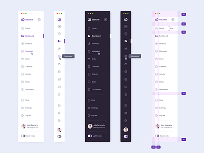
|
| Fig 6.2. Side Menu Design |
- Macro-Animations
The transition works similarly to the
notification screens: since the hamburger icon
is on the left, the menu slides in from the
left as well. Users can click anywhere outside
the menu to close it, allowing for a quick and
intuitive way to exit. Else, they can click on
the back button to exit.


|
| Fig 7.1. Redesigned Accounts |
- Micro-Animation
This section includes minimal
micro-animations, but the buttons displayed
on the screen incorporate a hover effect.
This effect provides a subtle, interactive
response when users tap or hover over each
button, creating a more engaging and
responsive experience.
- Macro-Animation
The animation in this section highlights
the account card after users select the
one they wish to view. Upon tapping, the
card lifts slightly, providing a subtle 3D
effect. Users can then flip the card to
reveal detailed information, such as the
CCV, expiration date, and other key
details, enhancing the interactive and
engaging feel of the experience.

|
| Fig 7.2. Flipping Card |
H. Transfer

|
| Fig 8.1. Redesigned Fund Transfer |
- Micro-Animation
I plan to animate the red gift box in the
confirmation message, but the final animation
will depend on how the visual effect looks once
I complete the animation process. This will help
determine whether the animation enhances the
overall user experience or needs further
adjustments.

|
| Fig 8.2. Intended Gift Box Animation |
- Macro-Animation
When the user fills out the text box, the drop
shadow effect will temporarily disappear. Once the
user finishes entering the information, the drop
shadow effect will reappear, providing a visual
cue that the text box has been
completed.
|
| Fig 8.3. Micro and Macro Animations of Fund Transfer section |
As mentioned in Figure 1.9, I plan to incorporate an engaging animation that will display while users wait for their fund transfers to be processed. As the transaction processes, animated coins will fall gradually, filling up the screen. When the screen is completely filled with coins, it indicates that the transaction has finished loading. This animation is designed to enhance the user experience by providing visual feedback during the transfer process, making the waiting period feel shorter and more interactive.
 |
| Fig 8.4. Transaction Loader Reference |
I. Masterplan
The masterplan will encompass a range of
animations, including both micro and macro
elements. Micro animations will focus on
subtle, detail-oriented movements that enhance
user interactions, such as button presses,
hover effects, and transitions, creating a
smoother and more intuitive experience. Macro
animations, on the other hand, will involve
larger, more noticeable animations that guide
users through the app or emphasize important
features, like page transitions, loading
sequences, and interactive storytelling
elements. Together, these animations will work
to create a cohesive and engaging experience,
balancing functional feedback with immersive
visual appeal.
Fig 9.1. Masterplan
Final Task 2: Interaction Design Proposal
and Planning
Fig 10.1. Final Task 2: Interaction Design Proposal and Planning - Slides
Fig 10.2. Final Task 2: Interaction Design Proposal and Planning - Presentation Video
REFLECTION
Experience
At first, balancing subtle animations with larger, attention-grabbing ones felt challenging. I learned that while micro animations, like button hovers, enhance user engagement by guiding actions, macro animations need to stay smooth and not overwhelm the user. This process helped me understand how animations contribute to a cohesive design, making the app feel more interactive and friendly.
Observations
I noticed that micro animations, such as hover effects or sliding lines, make the app feel more alive without distracting the user. These small touches give users feedback and make navigation feel intuitive. On the other hand, macro animations, like carousels or page transitions, have a more noticeable impact on the experience. They need to be thoughtfully timed and paced to keep users engaged without creating visual clutter. Observing these effects helped me see how both animation types work together to improve the overall user journey.
Findings
Through this project, I found that animations, whether small or large, play a crucial role in enhancing usability and aesthetics. Micro animations add polish, making interactions feel smoother and more responsive, while macro animations guide users through the app’s main actions in an enjoyable way. I also discovered that too much animation can overwhelm users, so striking the right balance is essential for creating a pleasant, effective design. These insights will be useful for future projects where engaging user experience is a priority.
Comments
Post a Comment