Advanced Typography - Task 1 / Exercises: Typographic Systems & Type & Play

Tan Zhao Yi / 0363285
Advanced Typography / Bachelor of Design (Honours) in Creative Media
Task 1 / Exercises: Typographic Systems & Type & Play
LIST
Lectures
LECTURES
Lecture 1: Typographic Systems
- Structural system
- Shape Grammars - Set of rules
- 8 major variation: Axial, Radial, Dilatational, Random, Grid, Modular, Transitional, Bilateral
- Additional criteria: Hierarchy, Legibility, Contrast etc.
1. Axial
- Organised to a single axis (straight or bend)
2. Radial
- Extended from a point of focus
3. Dilatational
- Expand in a circular method
- Multiple rings
- Hierarchy
4. Random
- No specific pattern
- Has a order in the chaos
5. Grid
- Grid system
6. Transitional
- Layered banding - segregating info in bands
7. Modular
- Information units has to be standardised (shape, size etc.)
- Able to switch around within units
8. Bilateral
- Text arranged symmetrically on a single axis
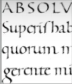
Letterpress Printing


Fig 1.1. Letterpress Printing
- Producing copies by repeatedly imprinting inked raised surface on papers
- Only able to organised information in horizontal or vertical form
Lecture 2: Typographic Composition
Principle of Design Composition: Emphasis, Isolation, Repetition,
Symmetry/Asymmetry, Alignment, Perspective

|
| Fig 2.1. Emphasis |
The Rule of Thirds: A photographic guide to composition.

|
| Fig 2.2. The Rule of Thirds |
Other systems:
Environmental Grid: The outcome system of the exploration of existing
structure / the combination of numerous structure.

|
| Fig 2.3. Environmental Grid |
Form and Movement: The exploration of the exiting Grid System, which
allow us explore the multitude of options the grid offer, and to see the
turning pages as a slowed-down animation. The placement of the elements on
a page (paper/screen) create movements.

Letterform through the ages:
1. Cuneiform
- Distinctive wedge forms - result of pressing the blunt end of a reed stylus into wet clay tablets
- Evolved from pictograms
- Written left to right

|
| Fig 3.1. Cuneiform |
- A mixture of both rebus and phonetic character
- Hieroglyphic images may be used as
- Ideograms - represent things
- Determinatives - indicate general idea of the word
- Phonograms - represent sound that "spell out" words

|
| Fig 3.2. Ancient Hieroglyphic Chart |
- Written both left to right / right to left
- Drawn freehand, no serifs.
- In time the strokes grew thicker, the aperture lessened and serifs appeared.

|
| Fig 3.3. Early Greek |
4. Roman Unicials
- Curved form allow less strokes and could be written faster.

|
| Fig 3.4. Roman Unicials |
5. English Half Unicials
- In England, the unicials evolved into a more slanted and condensed form.

|
| Fig 3.5. English Half Unicials |
6. Carolingian Minuscule
- Important development
- Became the pattern for the humanistic writing of the 15th century - basis of lowercase Roman type

|
| Fig 3.6. Carolingian Minuscule |
7. Black Letter
- Characterised by tight spacing and condensed lettering.
- Evenly spaced verticals dominated the letterform.
- Condensing line spacing and letter spacing reduced the amount of costly materials in book production.

|
| Fig 3.7. Black Letter |
8. The Italian Renaissance
- The renaissance analysis of form that was being applied to art and architecture was directed toward letterform - resulting in a more perfect or rationalised letter.
|
| Fig 3.8. The Italian Renaissance |
- Printing wood block in China, Japan and Korea
- Earliest printed illustration
- Several decades before the earliest printing in Europe, the Koreans establish a foundry to cast movable type in bronze - allowed the dismantling and resetting of text.

|
| Fig 3.9. Movable Text |
Evolution of Scripts

|
| Fig 3.10. Evolution of Middle Eastern Alphabets |
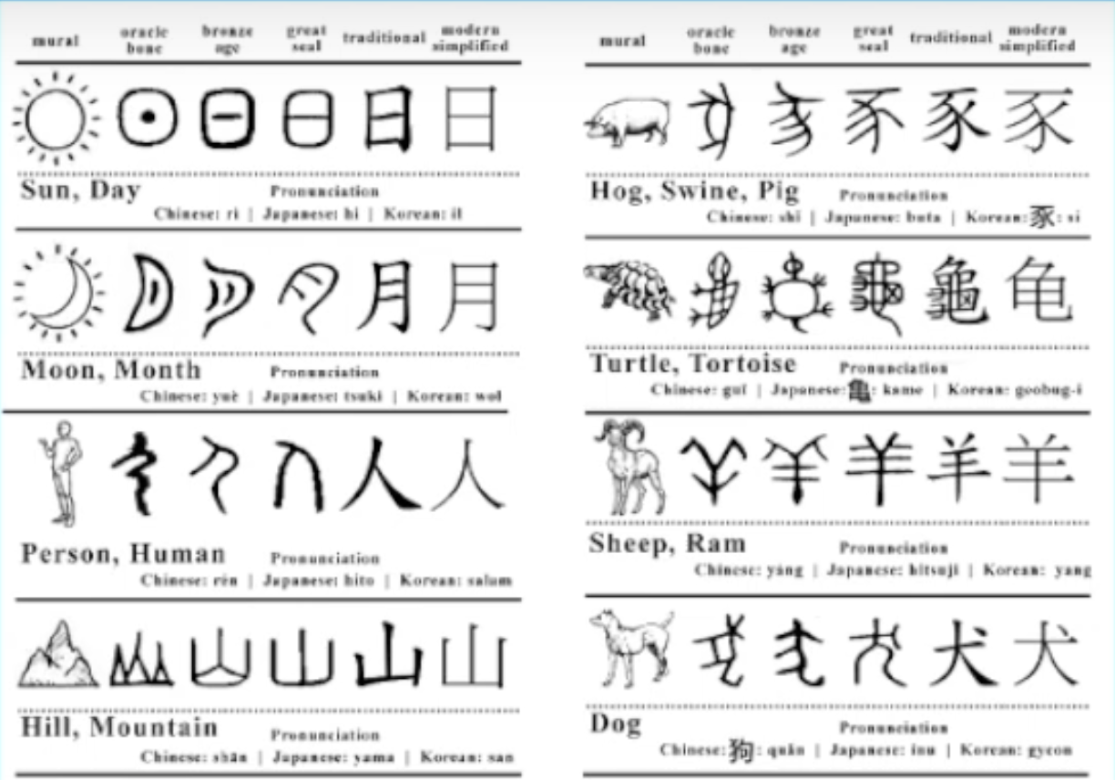
|
| Fig 3.11. Evolution of the Chinese Scripts |
Lecture 4: Designing Type
General Process of Type Design:
1. Research
- Understand type history, type anatomy and type conventions
- Terminologies, Metrics, Hinting
- Examine existing font for inspiration, ideas, reference etc.
2. Sketching
- Traditional (brushes, ink, papers) - better control, but slow
- Digital (font design software) - quicker and consistent, but sometimes impede natural movement of hand strokes
3. Digitalisation
- FontLab / Glyphs App
4. Testing
- Refinement / Correction of typeface
- Prototyping
- Leads important feedback
5. Deploy
- Teething issues remain minor
Typeface Construction

|
| Fig 4.1. Typeface Construction |
Lecture 5: Perception and Organisation
- Perception: The way in which something is regarded, understood, or interpreted.
- Perception in Typography: Deals with the visual navigation and interpretation of the reader via contrast, form and organisation of the content. Content can be textual, visual, graphical or in the form of colour.

Fig 5.1. Contrast
Based on the fig 5.1, different use of text create
contrasts. It is importance to create contrast as to
create distinction or differentiation between
information.

Fig 5.2. Contrast of Size
A contrast of size provides a point to which the reader's
attention is drawn. For example if you have a big letter and a
small letter you will obviously see the big letter first before
the small. The most common use of size is in making a title or
heading noticeably bigger than the body text.

Fig 5.3. Contrast of Weight
Weight describes how bold type can stand out in the
middle of lighter type of the same style. Other than then using
bold, using rules, spot, squares is also provide a "heavy area"
for a powerful point of visual attraction or emphasis, therefore
not only types of varying weight.

Fig 5.4. Contrast of Form
Contrast of form is the distinction between a capital
letter and its lowercase equivalent, or a roman letter and
its italic variant.

Fig 5.5. Contrast of Structure
Structure means the different letterforms of different
kinds of typefaces. For example, a moonlike sans serif and a
traditional serif, or an italic and a blackletter.

Fig 5.6. Contrast of Texture
By putting together the contrasts of size, weight, form and
structure, and applying them to a block of text on page, the
contrast of texture formed. Texture refers to the way the
lines of type look as a whole up close and from a distance.

Fig 5.7. Contrast of Direction
Contrast of direction is the opposition between vertical
and horizontal and the angles in between. Turning one word on
its side can have a dramatic effect on a layout. Text blocks
also have their vertical and horizontal aspects of
direction.

Fig 5.8. Contrast of Colour
The use of colour is suggested that a second colour is
often less emphatic in values than plain back on white.


Fig 5.9 Form
Form refers to the overall look and feel of the
elements that make up the typographic composition. It is the
part that plays a role in visual impact and first
impressions. Displaying type as a form provides a
sense of letterforms' unique characteristics and abstract
presentation.
#Organisation / Gestalt
Gestalt is a German word meaning the way a thing has been
"placed" or "put together". Gestalt Psychology is an attempt
to understand the laws behind the ability to acquire and
maintain meaning perceptions.
Gestalt theory emphasises that the whole of anything is greater
than its parts.
Organisation / Gestalt: Perceptual Organisation /
Groupings

Fig 5.10. Gestalt Principles
1. Law of Similarity
Gestalt grouping law that states that elements are similar
to each other tend to be perceived as unified group.
Similarity can refer to any number of features, including color,
orientation, size, or indeed motion.
2. Law of Proximity
Gestalt grouping law that states elements that are close
together thend to be perceived as a unified group.
This straightforward law states that items close to each
other tend to be grouped together.
3. Law of Closure
Mind's tendency to see complete figures or forms even if a
picture is incomplete, partially hidden by other
objects.
4. Law of Continuation
Law of good continuation holds that humans tend to perceive each
of two or more objects as different, singular, and uninterrupted
object even when they intersect.
5. Others: Law of Symetry & Law of Simplicity (Praganz)
The idea is to ensure awareness and inform the work
process.
INSTRUCTION
Task 1 / Exercice 1: Typographic Systems
We were instructed to design different text layouts based on the eight
variation, which is Axial, Radial, Dilatational, Random, Grid,
Modular, Transitional and Bilateral.
Task Requirements:
- Use InDesign only.
- Page Size: 200 x 200 mm
- Limited graphic elements are allowed.
- Other than black, you can use one another colour.
Week 1 Practical
In Week 1, we were instructed to try out the Axial system
first.
A. Research
There's several ways to create axial design. First, the basic one, make them symmetry.

|
| Fig 3.1.1. Symmetry, Week 1 (30.8.2023) |

|
| Fig 3.1.2. Adjusting Column Width, Week 1 (30.8.2023) |

|
| Fig 3.1.3. Angle Axis, Week 1 (30.8.2023) |

|
| Fig 3.1.4. Graphic Element, Week 1 (30.8.2023) |
B. Sketches
I made some rough sketches to find inspirations in class. It was
overwhelming at first because I hadn't do much exercise for a while since
semester break. I've been trying different layouts but none of them
satisfies me.

|
| Fig 3.2.1. Rough Sketches, Week 1 (30.8.2023) |
Final Sketches
After a few practicing, I made up my mind to go with the four sketches
below.

|
|
|

|
|
|
I still felt something weird in these attempts. Although Axial is
the most basic system in eight of them, it is hard to come out with
creative and impactful design for me.
Week 1 Attempts
1. Axial

|
| Fig 3.3.2. Axial - Attempt #2, Week 1 (2.9.2023) |
I initially focused on lightening the title's weight to maintain balance.
However, as I experimented with various ideas, the results left much to be
desired. In all honesty, I found them quite plain and unattractive, which
left me somewhat dissatisfied with my progress.
Font Used
Left: ITC Garamond Std - Book
Middle: Futura Std - Book and Medium
Right: Futura Std - Book, Medium and Heavy
2. Radial

|
|
|
Following the basic principles of radioactivity, I believe that the key elements of a radiation system consist of information presented in bands. I created some design based on this concept, dividing the text into strips of varying lengths and thicknesses to approximate the form of radioactive elements.
Font Used
Left: Futura Std - Book and Light Oblique
Right: Univers LT Std - Light, Roman and Oblique
3. Dilatational

|
| Fig 3.3.4. Dilatational - Attempt #1, Week 1 (4.9.2023) |
One of the primary challenges was striking the right balance between
expansion and legibility. I believe in typography, after all, must
communicate effectively. I experimented with various angle, sizes, and
spacing options to find that elusive sweet spot where text could breathe
and expand while maintaining readability.
Left: Futura Std - Book, Medium and Light
Middle: Futura Std - Book
Right: ITC Garamond Std - Book, Futura - Book
4. Random

|
|
|
Designing a random system has been a lot of fun, allowing me to get
creative with text in ways I hadn't before. In the left design, I used
different font styles to create a sense of randomness. I also found that
adjusting kerning and letter spacing, can create interesting visual
effects. It's been an eye-opening experience.
Font Used
Left: Univers LT Std - Roman and Light
Right: Univers LT Std - Roman, Light, Bold, Black and Oblique
5. Grid

|
|
Fig 3.3.6. Grid - Attempt #1, Week 1 (5.9.2023) |
Determining the ideal grid configuration was a pivotal starting
point. After experimenting with different grid structures, I settled
on a grid system with 3 rows, 4 columns and 5mm gutters, fitting
guides in margins. I tried to accommodate content into grid boxes while maintaining
consistency and alignment.
Font Used
Univers LT Std - Roman, Black and Bold
6. Transitional
|
|
|
|
My transitional typographic system was built upon the insights
gleaned from the left design of random typographic system.
It was a surprising revelation to find that certain design
elements from the random system could seamlessly transfer to
transitional system. Drawing from this newfound connection, I
made the decision to adapt and extend design elements from the random
system to the transitional typographic system. By adapting
elements borrowed from the random system with the traditional
attributes of transitional typography, I aimed to create a balanced
and visually captivating design.
Font Used
Univers LT Std - Roman and Light
7. Modular

|
|
|
Font Used
Left: Futura - Medium and Bold
Right: Futura - Medium and Bold
8. Bilateral

|
|
Fig 3.3.9. Bilateral - Attempt #1, Week 1 (5.9.2023) |
Font Used
Left: ITC Garamond Std -
Book, Light and Bold
Right: ITC Garamond Std - Book, Light and Bold
Final Task 1 / Exercise 1: Typographic
System

|
| Fig 3.4.1. Final Axial System - JPG, Week 2 (11.9.2023) |

|
| Fig 3.4.2. Final Radial System - JPG, Week 2 (11.9.2023) |

|
| Fig 3.4.3. Final Dilatational System - JPG, Week 2 (11.9.2023) |

|
| Fig 3.4.4. Final Random System - JPG, Week 2 (11.9.2023) |

|
| Fig 3.4.5. Final Grid System - JPG, Week 2 (11.9.2023) |
|
|
| Fig 3.4.6. Final Transitional System - JPG, Week 2 (11.9.2023) |

|
| Fig 3.4.7. Final Modular System - JPG, Week 2 (11.9.2023) |

|
| Fig 3.4.8. Final Bilateral System - JPG, Week 2 (11.9.2023) |
|
Fig 3.4.9. Final Task 1 - Exercise 1: Typographic System -
PDF, Week 2 (11.9.2023)
|
Fig 3.4.10. Final Task 1 - Exercise 1: Typographic System with Grids
and Guides - PDF, Week 2 (11.9.2023)
Task 1 / Exercice 2: Type & Play
A. Finding Type
We were assigned to observe type in an image either object, structure
or nature. The main objective of this task that Mr. Vinod mentioned
frequently is to find out the type that can represents the whole
picture. We will have to find at least 5 letters in the image.
It is an enjoying process while observing potential type. I took a
photo of the Taylor's lakeside, unfortunately I could only find 3
letters (C, J, T).
Then I found 5 letters (T, Y, U, A, H) on a human skin texture image.
However, I think these letterform couldn't represents skin
textures.


Fig 4.1.1. Fail attempts of images, Week 2 (11.9.2023)
In the end, I decided to go with an image of the vein of a
leaf.

|
| Fig 4.1.2. Vein of a leaf, Week 2 (11.9.2023) |
I traced out the letters that I found in this image, which is Y, T,
A, H and F.

|
| Fig 4.1.3. Letter Extraction, Week 2 (11.9.2023) |
I noticed that the T's stroke is way more wider than the others. and
the Y and A are too thin. I think the edges are the most representative
part of the letterform.

|
| Fig 4.1.4. Extracted Letters - Y, T, A, H, F, Week 2 (11.9.2023) |
B. Sketch
I drew out a rough sketch of my ideation for the final visual of the
letters. I will explain the transition in Digitalisation.

|
| Fig 4.2.1. Sketches, Week 2 (11.9.2023) |
I chose Marlide Display as my reference to help with my refinements. It
is because they have similar edges as the extracted letters.


|
| Fig 4.3.1. 1st Attempt Progress, Week 2 (12.9.2023) |

|
| Fig 4.3.2. 1st Attempt - Sharp Edges, Week 2 (12.9.2023) |

|
| Fig 4.3.3. 2nd Attempt - Flare Edges, Week 3 (13.9.2023) |
Final Task 1 / Exercise 2: Type &
Play

|
| Fig 4.4.1. Final Type Design, Week 3 (13.9.2023) |

|
| Fig 4.4.2. Compiled Progression, Week 3 (13.9.2023) |

|
|
|

|
|
|

|
|
|

|
|
|

|
|
|

|
| Fig 4.4.8. Extracted letterform compared to final type design, Week 3 (13.9.2023) |

|
| Fig 4.4.9. Final Typeface Showcase, Week 3 (15.9.2023) |
Fig 4.4.10. Final Type & Play - PDF, Week 3 (19.9.2023)
FEEDBACK
Week 2
General Feedback: Random system has to be more random, it should be like an ice-cream spilt on the ground - that random. Avoid using colours to create contrast.
Specific Feedback: Avoid using light weight fonts because it reduced the readability.
Specific Feedback: Avoid using light weight fonts because it reduced the readability.
Week 3
General Feedback: Design font that represents the whole image chosen.
Specific Feedback: The characteristic of the structure is the connections are flare, not sharp. It's fixable.
Specific Feedback: The characteristic of the structure is the connections are flare, not sharp. It's fixable.
Week 4
General Feedback: The main character in your poster is your font, not the background picture.
Specific Feedback: Great work for the poster.
Specific Feedback: Great work for the poster.
REFLECTIONS
Experience
For Exercise 1, it's quite challenging because we had to come up 8
satisfying designs in 1 week. While complying with the formula, it's
limited to come up with all creative designs especially after we
refers to senior or other designer's work.
Comparing to last semester learning, it seems that Advanced
Typography allows me to had a lot more fun. It's really enjoyable
during the progression of Exercise 2: Type & Play, however I think
I should work more on it for refinement.
Observations
This is our first time to include colours in Exercise 1. It is
interesting observing how colour impacts in the whole visual, like how
it takes viewer attention, how it brings focus on the headline, how it
makes the design worst etc. In a nutshell, colours should be employed
sparingly or with a clear purpose.
Also, I observed that I still couldn't come out with a typeface
that maintains stability. In Exercise 2, the letters are obviously not
stable for me. The possible reason might because of my inconsistent
crafting on the strokes and stems.
Findings
The typographic systems enrich my cognition of information layouts in
a poster. In my past lives, I've never paid attention of layouts on a
poster, neither a not-so-formal design such as Radial, Transitional,
or Random. I found out that if there's a poster using that kind of
layout, I would have had a long-term impression, which counts as
interactive effectiveness, right?
FURTHER READING

|
| Fig 5.1. Design School: layout by Richard Poulin |
#Section 5: Layout Characteristics (pg 151-179)
- Pacing and Sequencing
A well-designed pace and sequence of layouts incorporates visual
brakes, pauses, and variation to maintain reader's interest,
comfortably interact with information presented. Both of these visual
characteristics can be achieved by increasing / decreasing the visual
elements (type, colour, space, imagery) in a compositional
layout.
Ask yourself what you want reader to experience every time
turning a page - over-scaled type and images, unconventional cropped
images, sidebars etc. creates variations in pace and sequence.

|
| Fig 5.2. Pace and Sequence |
- Pattern and Form
- Assists reader in seeing distinctions between one element and another
A specific type of visual texture and is traditionally derived from a
defined and repeated compositional structure that always appears in an
organised and regimented manner.
I. Events / Objects / Elements that always repeat themselves (exp.
checkerboard)
II. Simple decorative patterns of stripes / zigzags / polka dots.
III. Visually complex - can be found in art and the built environment
(exp. spheres, lattices, polyhedra, spirals etc.)
Form
The different shapes / structures of visual elements in compositional
layout, consisting of multiple surfaces and edges. Form is achieved by
integrating depth / volume in the equation of shape, which can also be
indicated by the use of tone, shade and texture.

|
| Fig 5.3. Isometric and Axonometric Projections |
Isometric and axonometric projections are examples
of visualising a form's structure two-dimensionally.
Isometric
-Three visible surfaces of a form have equal emphasis
-All axes are rotated 30° away from the picture plane
-All lines are equally foreshortened
-Angles between lines are always 120°
Axonometric (plan oblique)
-Parallel projection viewed from a skewed direction
- Rhythm and Flow
Sound and silence in graphic design - form and space (active and
passive, primary and secondary)
Visual rhythm:
1. Regular - spatial intervals and compositional elements are
similar in size / length / visual character.
2. Flowing - conveys a sense of movement.
3. Progressive - created with a sequence of compositional elements
through defined progression of steps.
Space:
Space:
1. Actual Space - The area that a visual composition physically
occupies.
2. Psychological Space - A visual composition that influences mind
and ear of a reader.
3. Physical Space - Three-dimensional world.
4. Pictorial Space - The manipulation of a flat surface to create a
perception of depth / movement / direction.
- Alignment
- Flush Left, Flush Right, Justified, Centered etc.
- Emphasis, Hierarchy and Scale
- Emphasis
- Alignment
- Uppercase / Lowercase
- Color
- Contrast
- Italics
- Mixing Typefaces
- Position
- Size
- White Space
- Type Style and Weight
- Visual Cues
- Hierarchy
- Scale
- Objective / Subjective Scale
Comments
Post a Comment