Advanced Typography - Task 2A & 2B: Key Artwork & Collateral
20.9.2023 - 11.10.2023 / Week 04 - Week 07
Tan Zhao Yi / 0363285
I found my five word marks on Pinterest. I think all of them have the
same design traits: they exudes a contemporary elegance. Most of them
boasts a bold letterforms, creating a strong and striking visual
impact.
Final Key Artwork
My idea was to combine several animation together. Below is my first part
of animation:
Experience
Tan Zhao Yi / 0363285
Advanced Typography / Bachelor of Design (Honours) in Creative Media
Task 2A & 2B / Key Artwork & Collateral
LIST
Lectures refer to
Task 1.
Task 2A: Key Artwork
Task 2B: Collateral
INSTRUCTION
Task 2A / Key Artwork
Key artwork is also known as key visual, which is designed for branding and
printed repeatedly across media such as posters, box covers etc. In this
task, we will be using a word mark as our key artwork. It can be our
fist name or a pseudonym.
A. Research
Mr. Vinod asks us to find 5 word marks that we obsessed with. These
designs will help on our construction later on.

|
| Fig 1.1.1. 5 word marks (source:Pinterest), Week 4 (20.9.2023) |
B. Ideation and Sketches
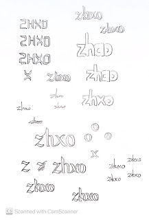
I decided to use my phone name 'zhxo' in my word mark. It's a transition
from the centre word of my name 'Zhao'. As my friend always identify me
with 'zhxo' when we AirDrop each others documents, I think it is more
representative for me. In the other hand, 'Zhao' is actually a family name
in Chinese, it will be so popularised if I use that as my label.
I developed my ideation through sketching because I prefer to write rather
than thinking. Also I don't have a specific ideas for my word mark. What is
on my mind right now is the word mark will be expressing my style and
identity.
Fig 1.2.1 shows my sketches.
My ideas on the key artwork:
1. High contrast: Conveys a sense of delicacy.
2. Gothic aesthetic: Include somewhat mysterious, represents the first
impression I always give to others.
3. Formality: Represents my personality.
4. Subversive stroke: Rebellion. I value my individuality and willing
to take daring steps.
C. Digitalisation

|
| Fig 1.3.1. Digitalisation, Week 5 (27.9.2023) |
I tried to digitalised other sketches but it doesn't work, so I'll
stick with my final sketch. In the feedback section, Mr. Vinod said
that the readability of "zhxo" is low. I was thinking to change it to
"zhao", in the end I don't like it.
I maintained with "zhxo", and made some refinement from my sketches:
smoothen the strokes, assessing with its consistency etc.

|
| Fig 1.3.2. White Space, Week 5 (27.9.2023) |
I create a white space between strokes of 'z' and 'x' because it
implies sophistication.

|
| Fig 1.3.3. Progression, Week 5 (27.9.2023) |
Fig 1.3.3. shows the progression of my key artwork. Before I finalised
it, Mr. Vinod suggests to reduce the tips' sharpness of 'z' and
'x'.

|
| Fig 1.3.4. Final Key Artwork (Black & White), Week 5 (1.10.2023) |
Task 2B / Collateral
Then, we were tasked to transform our own key artwork into a brand by
collaterals.
Collateral:
1. Animated Key Artwork (800x1024px, GIF)
2. Instagram account
3. Mock-ups: T-shirt, label pin, signboard etc.
If instructed, we will need to print out our collateral.
In my key artwork, as I mentioned I valued my personalities, I want to
create a skin care brand to indicate self-care and self-love. I wish to
empower individuals to embrace their inner and outer beauty. My key
artwork serves as a compelling representation of my brand message: "Infinite
possibilities on you."
First we were instructed to search for a colour palette on
Color Hunt for our
brand.
My colour palette: #323232, #FA4EAB, #FE83C6, #FFF2F9.
1. Animated Key Artworks
Requirements:
i. 800/1024 px, height and weight
ii. GIF format
To create the animation, I created separate layers in Adobe Illustrator and
imported them into Adobe After Effects. In AE I used the timeline to create
each layers' movements.

|
| Fig 2.1.1. Timeline in AE #1, Week 6 (6.10.2023) |
The second part of the animation are created by different colour of my word
mark. I think changing colours added a sense of variety for my branding, and
evoke a range of emotions which can communicate with audiences.

|
| Fig 2.1.3. Timeline in AE #2, Week 6 (6.10.2023) |

|
| Fig 2.1.4. Animation #2, Week 6 (6.10.2023) |
And the last animation serves as a ending scene.

|
| Fig 2.1.5. Timeline in AE #3, Week 6 (6.10.2023) |

|
|
|
Final Animated Key Artwork

|
| Fig 2.1.7. Final Animated Key Artwork, Week 6 (6.10.2023) |
2. Instagram Cards
As we were going to create a new Instagram account, I need to design some
cards to post on it. All of my cards are 210 x 210mm, designed according to
the colour palette.

|
| Fig 2.2.1. Instagram Cards Attempts, Week 6 (6.10.2023) |
This part was challenging for me to develop my idea because we couldn't
make changes to our word mark. I was thinking to create a significant icon
and I chose the 'x' because most of the time, especially in maths, x
indicates a mysterious role, which would match my brand
message.
Then I tried to use the 'x' repeatedly to form a pattern but
it doesn't work. Surprisingly, I like the pattern of repeated 'zhxo'.
I also include my brand message: "Infinite possibilities in you." in some
of the cards.
Final Instagram Cards

|
| Fig 2.2.2. Instagram Card #1, Week 6 (6.10.2023) |

|
| Fig 2.2.3. Instagram Card #2, Week 6 (6.10.2023) |

|
| Fig 2.2.4. Instagram Card #3, Week 6 (6.10.2023) |

|
| Fig 2.2.5. Instagram Card #4, Week 6 (6.10.2023) |
3. Collaterals
A. Product Package
I chose product package boxes as my first collateral because it serves as a
tool to make my brand easily recognisable if it was designed unique. I will
be repeating the cards design for my collateral to create consistent brand
identity.
Also, I create another design for the greeting card. There are two
different colour of it to represent if the skincare product is for day-use
(white) or night-use (black).

|
| Fig 2.3.2. Collateral - Product Package, Week 7 (11.10.2023) |
B. Lotion
At the mock-up beginning session, Mr.Vinod advised us to not to just paste
our artwork in everywhere. I used the Instagram card #1 as my signature
pattern.
C. Stickers
Stickers were used as my promotional items for customers, or to create
limited edition products or seasonal packaging.
Additional: Printed T-shirt
At Week 9, Mr.Vinod asked us to print out our key artwork on a t-shirt and wear it to class.
At Week 9, Mr.Vinod asked us to print out our key artwork on a t-shirt and wear it to class.
Final Task 2A & 2B: Key Artwork & Collateral
 |
| Fig 2.4.1. Final Key Artwork, Week 7 (13.10.2023) |
Fig 2.4.2. Final Key Artwork (coloured), Week 7 (13.10.2023)
 |
| Fig 2.4.3. Final Animated Key Artwork (coloured), Week 7 (13.10.2023) |
Introduce Final Key Artwork:
 |
| Fig 2.4.6. Collateral - Product Packages, Week 7 (13.10.2023) |
Instagram Account: @__zhxo
 |
| Fig 2.4.8. Desktop Screenshot of IG Page, Week 7 (13.10.2023) |
| Fig 2.4.9. Final Task 2: Key Artwork & Collateral - PDF, Week 7 (13.10.2023) |
FEEDBACK
Week 4
General Feedback: Your word mark must have a representative meaning,
or else it's just a decoration.
Specific Feedback: The readability is low. The form and flow for the second attempt is good
but it's hard to pronounce as a brand.
Week 5
General Feedback: no general feedback given
Specific Feedback: The composition is nice, it's just minor crafting problem. Make it smoother, and delete the tip of every end of the strokes.
Week 6
General Feedback: You need to expand your idea for brand identity. Don't just paste the
same thing on the product.
Specific Feedback: Same comment as general feedback. Don't just paste the same thing on the product.
Week 7
General Feedback: Do not keep repeating your wordmark in every Instagram posts.
Specific Feedback: no specific feedback given
REFLECTIONS
Experience
Designing my own word mark and crafting branding collaterals has been an
emotionally charged journey. It was, at times, a stressful process, as it
required significant time and introspection. I found myself dedicating
hours to pondering my own personality, values, and the deeper facets of
life. This reflective journey often pushed me out of my comfort zone,
challenging me to translate these complex emotions into visual elements.
However, it was precisely this emotional investment that added depth and
authenticity to the resulting word mark and branding.
Observations
I observed that design impacts on brand identity. I need to maintain it's
consistency across brand collaterals to boost recognition.
Findings
I found out the rough concept of branding. Design's impact on brand identity is evident. In the duration of this product, I started to observe at famous brand designs in shopping malls. A unique and well-designed logo enhances audience interactions and make them more likely to remember the brand. Conversely, a poor product design makes a brand less competitive to other brands.
I found out the rough concept of branding. Design's impact on brand identity is evident. In the duration of this product, I started to observe at famous brand designs in shopping malls. A unique and well-designed logo enhances audience interactions and make them more likely to remember the brand. Conversely, a poor product design makes a brand less competitive to other brands.
FURTHER READING

|
| Fig 3.1. Letterhead + Logo Design 12 by Oxide Design Co |
#11: Typographic
This book provides various of logo designs that were created by
different method.
Building images with type.
In a testament to the power of simple, typographically based
marks, the Des Moines Playhouse comes to life as the curtain
rises in their logo.
Others good examples provided by the book:
Brand identity samples:


Comments
Post a Comment