Design Principles - Task 3: Design

Tan Zhao Yi / 0363285
Design Principles / Bachelor of Design (Honours) in Creative Media
Task 3 / Design
LIST
Task 3: Design
INSTRUCTION
Task 3: Design
In this task, we will have to come out with a work of design inspired by the artwork that we have analysed in Task 1 and Task 2. In the outcome, we have to apply our knowledge of design principles in it. We can use any material for the final design, except the direct use of photographs.
Requirements:
1. Visual references
2. 3-5 digital / manual sketches
3. A4 size final design, JPEG format
4. 150-200 words rationale explaining the decisions made and the
purposes of the design, including the design principles
applied
A. Research
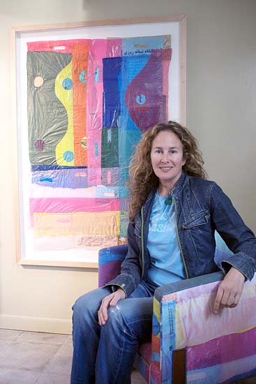
Before finalising my choice of artwork in Task 1, I found an artist that quite inspired me by her artwork - Dianna Cohen. Dianna Cohen is a visual artist who works with recycled plastic bags to create thought-provoking sculptures and installations. Her work explores the ecological and aesthetic implications of plastic pollution in marine environments.
A. Research
Before finalising my choice of artwork in Task 1, I found an artist that quite inspired me by her artwork - Dianna Cohen. Dianna Cohen is a visual artist who works with recycled plastic bags to create thought-provoking sculptures and installations. Her work explores the ecological and aesthetic implications of plastic pollution in marine environments.
|
| Fig 1.1. Dianna Cohen with her artwork |
B. Moodboard
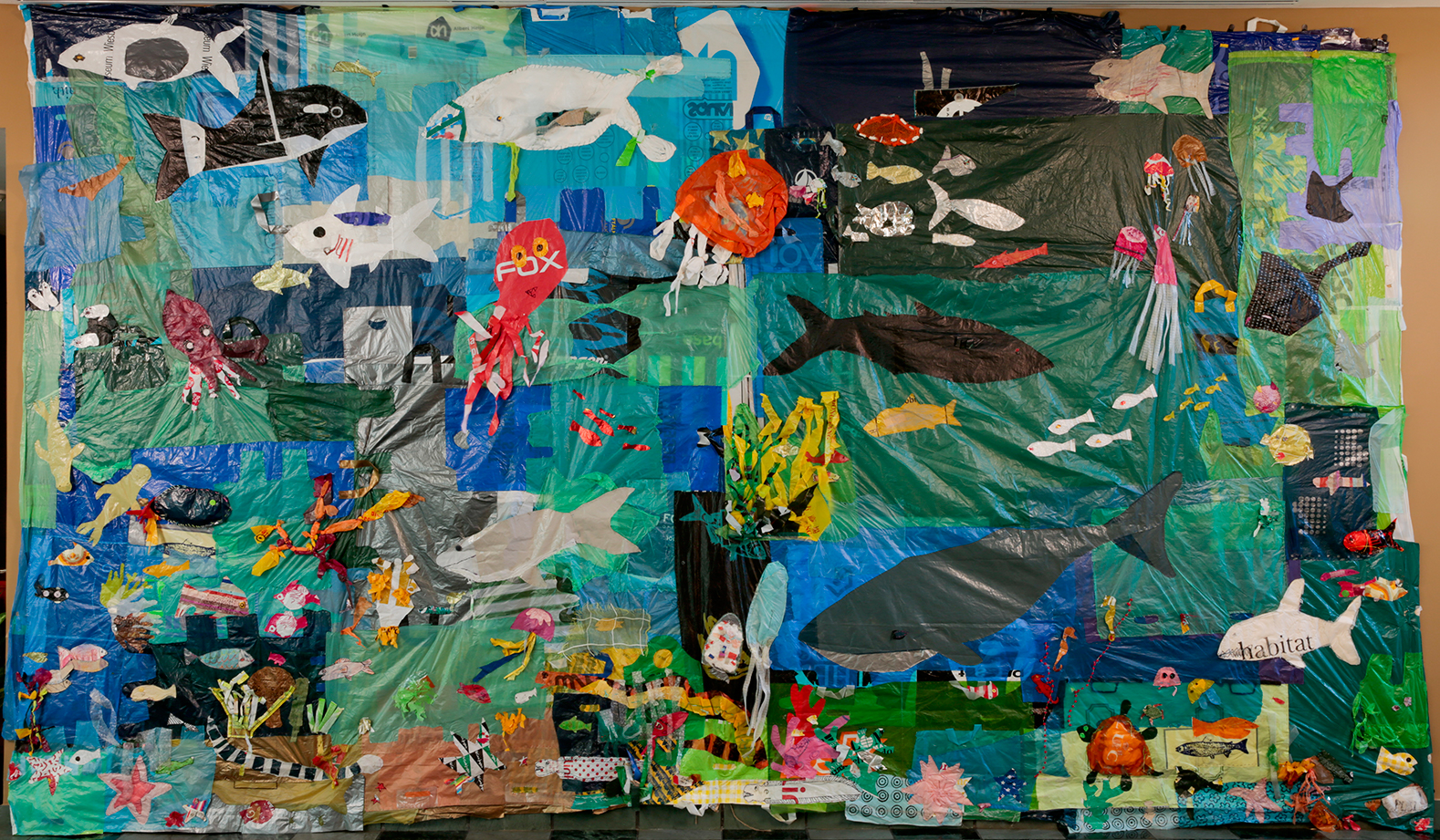
Figure 2.1 depicts my favourite artwork by Dianna Cohen, a poignant reflection on the intersection of plastic pollution and marine life. This artwork resonates deeply with my selection of UNSDG 14: Life Below Water.
|
| Fig 2.1. Ocean of Plastic by Dianna Cohen |
Asher Jay is an illustrator and conservationist known for her intricate illustrations that address environmental issues.
Image #1 (left) - Up the Food Chain by Asher Jay


Image #2 (right) - Plastic Soup by Asher Jay
Image #1 attracted me by its colour using. In the context of environmental issues, green is commonly associated with toxicity and pollution because it is often used to represent environmental hazards such as chemical contaminants, algae blooms, and industrial waste. Similarly, red is associated with danger, warning signs, and alerts, making it a fitting color to symbolize ocean pollutants and environmental threats. Red can evoke a sense of urgency and alarm, signaling the need for immediate action to address pollution and protect marine ecosystems. In the context of Asher Jay's artwork, red may be used to highlight areas of concern, draw attention to pollution hotspots, or symbolise the negative impacts of human activities on the ocean environment.
Then image #2 is closely related to my topic, which is plastic pollutants
that affect ocean ecosystems. I think the message this artwork wants to
bring out is to warn humans that plastic pollutants are heavily effecting
the underwater ecosystems because the artist place the fishes below the plastics.
C. Sketch
The reason I didn't choose Dianna Cohen's artwork in the end is
because it doesn't applicable to at least three design principles, so
I was thinking of creating my own artwork extended by her ideation. I
want to create an artwork made by plastic bags majorly to express the
main aim of SDG 14, which is reduction of marine pollution.

|
| Fig 3.1. Sketch #1 |

|
| Fig 3.2. Visual Reference - Sketch #1 |

|
| Fig 3.3. Sketch #2 |
In Sketch #2, I applied the gestalt principle of figure to form a fish using colourful plastics within its surroundings. By placing the fish centrally and enlarging it, I emphasised its significance as a representative of underwater creatures. This positioning draws attention to the fish and underscores its importance within the composition. Furthermore, I employed a contrast of colours and blank space to heighten visual impact.

|
| Fig 3.4. Sketch #3 |
Sketch #3 is an extended ideation from the image chosen from Task
1.

|
| Fig 3.5. Visual Reference - Sketch #3 |
In my sketch, I aimed to convey a sense of urgency as sea creatures strive to break free from polluted waters. I achieved this by creating a dynamic wave of movement, symbolising their eagerness to escape. To enhance contrast and highlight the plight of marine life, I utilised vibrant colours for the fishes while surrounding pollutants were depicted in shades of black and grey. Additionally, I incorporated the principle of continuation by aligning the curves of the fishes' swimming path, emphasising their collective struggle against the polluted environment.
After the peer feedback section, I decided to go with sketch #1 because it had a strong contrast between the ocean life and pollution that directly harm to it. Mr. Zeon asked me to add some drawings to deepen its presentative. The first thing came up to my mind is to draw some marine life activities below the blue plastics, inspired by Asher Jay's artwork - Plastic Soup. I was thinking to do further development in Adobe Illustrator.
While browsing for underwater art, I figured out that I could draw corals at the left side. Corals hold a unique significance in the ocean ecosystem, serving not only as mesmerising underwater creatures but also as vital habitats within the Earth's biosphere.

|
| Fig 3.6. Visual Reference - Underwater Garden by Clair Bremner |
I did my further development in Adobe Illustrator. I was thinking to draw some marine creatures and print it out, then stick them with the plastic pieces to create a mixed media artwork. Some of the fishes and corals are below and some are above from the plastics.

|
| Fig 3.7. Final Sketch (mixed media) |
Upon attempting to translate the sketch into reality, I encountered an obstacle: the limited variety of colours available in plastic bags and the transparency of each plastic piece posed significant challenges because it will cover up all the drawings. Thus, the idea of mixed media is abandoned. In the end, I decided to
apply the sketch in a illustration art form.
E. Digitalisation
In response to Dasha Nabullina's illustration, I want to create a digital artwork with
a similar theme and feeling. I decided to centre my theme around
simplicity and colourful, along with her inspiration from children book
illustration.

|
| Fig 4.1. Ideation of sea - #1 & #2 |
At the first I had two ideas for the ocean part - #1 (left) and #2
(right). #2 seems too unnatural because I found out that other artist
only draw the sea like this in a further top view, while sunshine shines
on the pure sea. Other than that, this appearance normally happens in
deep sea area, rather than the seashore.

|
| Fig 4.2. Reference - Ocean Waves by Francesca Long |
Apparently I choose option #1 for the background because it presents a
more logically flowing waves pattern. I Google searched some underwater
creatures for my drawing reference.


I named my digital artwork as Waves of Waste, I wish this title could highlight the pervasive issue of ocean pollution and the accumulation of waste in our seas. It suggests the idea of waves not only as natural phenomena but also as carriers of pollution and debris, drawing attention to the urgent need for ocean conservation. Fig 4.4. shows the first version of my digital artwork.
After asking my classmates feedback, I added some light and shadow effect in the ocean part to highlight the pristine beauty of a clean ocean, and endeavoured to restore the splendour of nature. Also, some of them suggest to lower the saturation or colour choices used in the pollutants to enhance the sense of contrast. These contribute to the second version of it.

Fig 4.3. Drawing References

|
| Fig 4.4. Waves of Waste - 1st version |
After asking my classmates feedback, I added some light and shadow effect in the ocean part to highlight the pristine beauty of a clean ocean, and endeavoured to restore the splendour of nature. Also, some of them suggest to lower the saturation or colour choices used in the pollutants to enhance the sense of contrast. These contribute to the second version of it.

|
| Fig 4.5. Waves of Waste - 2nd version |
 |
| Fig 4.6. GIF frames |
 |
| Fig 4.7. Importing files to Adobe Photoshop |
 |
| Fig 4.8. GIF timeline |
Final Digitalisation
Rationale:
The artwork "Waves of Waste" masterfully employs design principles to vividly depict the stark contrast between the pristine depths of the ocean and the polluted shores. Through powerful contrast, the clean left side sharply contrasts with the polluted right side, prompting viewers to confront environmental degradation. Continuation seamlessly guides the eye between these divergent scenes, enhancing composition coherence. The repetition of vibrant colors creates a cohesive visual style reminiscent of children's book illustrations, engaging viewers of all ages. This consistent use of stylistic elements reinforces unity and narrative impact, drawing viewers into a compelling story of environmental crisis and responsibility. Moreover, the principle of common region emphasises the shared space between contrasting environments, underscoring the need for collective action to address environmental challenges. The use of vibrant colours representing both vitality and decay, evoke emotions and spur reflection on human impact. Ultimately, "Waves of Waste" serves as a poignant reminder of humanity's responsibility to preserve marine ecosystems. It urges viewers to advocate for sustainable practices, aligning with the urgent call for environmental stewardship in today's world. (176 words)

|
| Fig 4.9. Waves of Waste - JPG |
Fig 4.10. Waves of Waste - PDF
 |
| Fig 4.11. Waves of Waste - GIF |
FEEDBACK
Week 6
Mr. Zeon mentioned that I could go further development with sketch #1 because it remains most
with the concepts. Sketch #2 maybe too flat, and somehow weak for the
topic unless I am going to making it three-dimensions. Sketch #3 is full of
movement. The sketches are some kind too simple, try to draw it with more details.
Week 7
Simple sketch with some explanation is also easy for viewer to understand. Mr. Zeon agreed for the decision of changing mixed media to digital artwork. I just need to finish my development with it and the rationale. Good.
REFLECTION
Experience
This final project combined the previous two tasks and allowed me to truly applied the design principles knowledge into practice in my own artwork. At first I wanted to present my work in a handwork form, however during the process I found that this method deviated from the main purposes of this module, fortunately I still have some time to reconsider about it.
Observation
As a designer who don't have a drawing background but I've always ease to create something that is impeccable, I observed that learning design principles really brought differences on my artwork by clarifying the path.
Findings
I found that intentional use of design principles can enhance the effectiveness of art in conveying important messages. By leveraging principles like contrast, repetition, and unity, I can create visuals that captivate audiences and spark meaningful conversations about pressing global issues. This experience highlights the importance of the appropriate way of using design principles in an artwork that helps in communicating complex ideas with audience.
FURTHER READING

Author: Cameron Chapman
This author focused on UI/UX.
#Emphasis
- Deals with the parts that are meant to stand out - the most important information
- Reduce the impact of certain info
- The most apparent in instances where “fine print” is used for ancillary information in a design
This website - Grind, is using different typography sizes create a nice example of contrast to emphasise content.
#Proportion
- The size of elements of relation to one another
- The bigger the element is, the important the messages it wants to convey
#Hierarchy
- Relates to how well content can be processed by people using a website
- The most important content should appear to be the most important
 |
| Capture Attention with Visual Hierarchy |
#Rhythm
- Spaces between repeating elements in design create rhythm similar to musical compositions
- 5 main types of visual rhythm: random, regular, alternating, flowing, progressive
- Random rhythm lacks pattern
- Regular rhythm maintains consistent spacing
- Alternating rhythm repeats a pattern with variation in elements
- Flowing rhythm mimics natural curves
- Progressive rhythm evolves over time, each change building upon previous iterations
 |
| Personal Project by Joe Furr |
#Variety
- Variety in design prevents monotony and maintains user interest
- Achieved through diverse elements such as colour, typography, images, and shapes
- Variety should complement other design elements
- Aim is to enhance overall aesthetic and user experience

Comments
Post a Comment