Advanced Interactive Design - Task 2: Interaction Design Planning and Prototype
Tan Zhao Yi /
0363285
Advanced Interactive Design / Bachelor of Design (Honours) in Creative Media
Task 2: Interaction Design Planning and Prototype
Published Text Animation Exercise: http://127.0.0.1:8090/text.html?62640119
Basically it is about the user act as a person who came to a
mystery library, carrying an oil lantern. The colour scheme will
be brownish with the old books, wooden texture, creating a
vintage visual feeling.
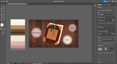
Based on the wireframes, I enhanced the illustration of each
page to present my final idea of the whole website flow. All of my work is done by using Adobe Illustrator.

Advanced Interactive Design / Bachelor of Design (Honours) in Creative Media
Task 2: Interaction Design Planning and Prototype
LIST
Lectures
Task 2: Interaction Design Planning and Prototype
INSTRUCTION
LECTURES
Lecture 3: Text Animation
In Week 6, we tend to have a chance to learn to animate text.

|
| Animating Text in Adobe Animate |
Task 2: Interaction Design Planning and Prototype
In this task, we are required to focus on their visual design
and begin planning the interactive elements and features of our
websites. Unlike traditional static websites, interactive designs
that include animations require plans that encompass both the
layout visuals and animation examples or references. We can create
our animations or use existing references to illustrate our
intended ideas.
A. Moodboard
Through some extended idea, I have a new mood board for my
thematic website.

|
| Fig 1.1. Website Moodboard |
B. User Flow

|
| Fig 2.1. User Flow |
C. Prototype
To recap, the website content will include:
1. Home Page
2. Derby Story
3. Characters
4. Farm Gallery
5. Author
I explored some colour pairing through ColorHunt, and the below are the colour palettes of the website.
1. Home Page
- Background: Bookshelf / Wooden
- Gradient balls and book are buttons, after clicking them, proceed to new session
- Animation: Floating gradient ball (Reference: https://pin.it/7uk1Io9Gs) and book
 |
| Fig 3.2. Home Page Prototype |
2. Story Session
- After clicking on the book, go into the story page, use light as transition.
- First, it will appear the tips of navigating the space, and there will be a button to let user start the story.
- The cursor will be followed by a small light as lantern while people use to brighten their visual when reading a book.
- The story illustration will took over the whole page, but there will be a progress bar at the bottom to let user locate the reading progress themselves in the website easily.
- After finish reading the story, proceed to the back cover of the book that display animated writing “The End”. The layout and other animation will be similar as the Home Page.
3. Characters
- Wooden Background
- If user clicked on the “Characters” button, they will be brought to a page with the transition of increasing gradient ball.
- There will be three buttons, which is Daisy, Farmer Joe and Tom.
- User can click on one of the button randomly, with clicking sound effect and clicked button animation. (Reference: https://pin.it/5Fs8iIoal )
- After user clicked on one of the button, the character with a text box will appear. In the text box, text will appear with typing animation, similar to the “The End”.
 |
| Fig 3.5. Farmer Joe's Intro |
4. Gallery
- When users click the "Gallery" button, they are taken to a page that showcases some images of the farm lives.
- User can navigates the gallery using the left and right buttons, when they click on it, there will be a clicking sound and animation like the character page.
- There will also be a progress bar at the bottom of the page.
- After clicking the “author” button, the page will appear a person is walking on a grass, direction from left to right but just stay walking in the middle.
- The ground and the sky will move, following the person walking. (Reference: https://pin.it/1TzqhJzrT )
- Then it will be similar as the character introducing themselves, the author will start to talk about her story of creating this website.
 |
| Fig 3.7. Author |
Prototype Image Reference Link:
Final Presentation
Presentation Video Link: Interactive Design Planning and Prototype
Fig 3.1. Final Presentation Video
REFLECTION
Experience
I enjoyed the creative process of envisioning how the interactive elements would come to life, particularly the idea of a storybook interface. Crafting the narrative and designing the user flow required a lot of brainstorming and sketching, which helped me refine my ideas and understand the scope of the project better. It was satisfying to see my initial concepts gradually take shape through wireframes and interactive elements.
Observations
Throughout this project, I observed that simplicity and clarity are key to effective design. Initially, I had many complex ideas, but I realized that too many interactive elements could overwhelm users. By focusing on a few well-executed features, like the animated book opening and character buttons, the website became more user-friendly. Additionally, I noticed that colour schemes and typography play a crucial role in maintaining a cohesive and engaging aesthetic, which is essential for keeping users immersed in the story.
Findings
One of the significant findings from this process is the importance of user engagement through interactivity. Interactive elements such as animated introductions and clickable story components not only make the website more appealing but also encourage users to spend more time exploring the content. Moreover, user feedback during the prototype phase highlighted the necessity of intuitive navigation and responsive design, ensuring that the website is accessible and enjoyable on various devices. This project has reinforced the idea that blending creativity with usability is essential for a successful interactive website.
FURTHER READING

Book Name: The Principles and Processes of Interactive Design
Author: Jamie Steane
Year: 2023
#Creating Smart Navigation
Navigation on a website should meet two key requirements:
1. Enhance Usability: Navigation should enable users to easily and consistently find desired items or information. This largely depends on the site’s architecture, including the intuitive positioning, hierarchy, and naming conventions of sections and subsections.
2. Ease of Management: Navigation should allow for easy creation, editing, deletion, and downloading of menu items. Text-based menus are preferable as they simplify editing and maintenance, allowing dynamic generation from a database and requiring smaller downloads. Although image-based menus can be attractive, they are less flexible and increase download times.
Designers also need to choose between horizontal and vertical menus. Horizontal menus utilize the screen's width, which is beneficial for sites with tables or many columns of data. However, they have limited space, often mitigated by using drop-down menus. Vertical menus, on the other hand, allow for unlimited growth by enabling users to scroll, accommodating additional items without requiring a page redesign.
Browser caching reduces a site's download time by storing images locally after the initial download, allowing reuse without re-downloading. Reusable graphics include:
- Framework Graphics: Homepage graphics can be reused on subsequent pages if the containers are properly constructed, such as the left and top images in different templates.
- Figure 4.1 is a site that reuses the left and top images for the second- and third- level templates, such as the second-level page shown in Figure 4.2.
 |
| Fig 4.1. Site that reuses the left and top images on second- and third-level templates. |
- Menu Mouseover Images: Using two small images for mouseover states instead of text images, enhancing usability. Figure 4.3 is a site that reuses two images for the mouseovers.
- Corners: Small corner images can be reused to round container edges, with the rest filled by XHTML background colour. Figure 4.5 is an example of such a corner.


Comments
Post a Comment