Application Design I - Final Project
22.7.2024 - 5.8.2024 / Week 14 - Week 15
Tan Zhao Yi / 0363285
Application Design I / Bachelor of Design (Honours) in Creative Media
Final Project
I found out that a spending analysis doesn't provide transaction
history. Using it as a reference, I redesign a Spending Analysis
with two charts.
In the Card Services - Cards, the visualise cards are from OUCH.
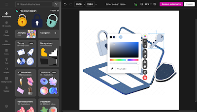
I extend the image in Adobe Illustrator, by using blue rectangle to replace the sky.
Then I found out that I missed out the live chat page in customer support. Other than providing live chat support, I created a small box that displays frequent asked questions (FAQ) that provides user convenient to just click on the question they may want to ask without typing all out.
Experience
Tan Zhao Yi / 0363285
Application Design I / Bachelor of Design (Honours) in Creative Media
Final Project
LIST
Final Project
INSTRUCTION
Final Project
We will syntesize the knowledge and experience gained in the
previous tasks for application in this final task. We were requested
to create integrate visual asset and refine the prorotype into a
complete working and funtional product experience for a selected
task.
A. Illustrations
In the high-fidelity prototype, we were allowed to add colours
and images in the app. Considering to add more illustrations as
Mr. Zeon mentioned, I looked for some suitable illustrations
from the website: OUCH
This website allows user to change the colours, but it
costs.
Thus, I abandon this website and discover another website: https://storyset.com/. It doesn't costs for changing colours but it has limited style
and only allows to change one colour.

|
| Fig 1.3. Changing Illustration Colour in StorySet |
Originally I was using 3D illustrations but I found that
it doesn't fit to the app as it is quite a formal platform. I
changed it to flat style.
B. Images
For the images, I use Pexels, which provides royalty free and high-quality photos. I
preferred using clear and high-resolution images because
it helps reinforce brand identity and values. Also, professional
images contribute to a polished and credible appearance. Users are
more likely to trust an app that looks well-designed and
professional, leading to increased user satisfaction and
loyalty.

|
| Fig 2.1. Images used from Pexels |
Turning to Account Management, I added a visual card to both
Current Account and Savings Account.
Also, while in the feedback section, Mr. Zeon mentioned that I
could visualise the Spending Analysis. I Google searched for some
example of spending analysis presentating way, and it comes out with
many tables, line chart, etc.

|
| Fig 2.3. Example of Spending Analysis |
Fig 2.4. Spending Analysis - before and after
In the Card Services - Cards, the visualise cards are from OUCH.

|
| Fig 2.5. Virtual Cards |
Additionally, I included a picture of Public Bank on the cover page. This visual element is designed to showcase the professionalism of Public Bank's team, thereby enhancing user trust and confidence in the institution.
 |
| Fig 2.6. Public Bank |
 |
| Fig 2.7. Extending image in Adobe Illustrator |
C. Reducing Text
Referring to the original PBe, the news and promotions messages is
full of text. Mr. Zeon suggested to reduce the text because it cause
frustration and user normally wouldn't like to read a bunch of small
text.
I cut off the main body of content for each messages and remain the
headings in "News" and "Promotions".
Before wrapping things up, I added some functions to enhance user
experience. The first feature is the home button in each page
because I realised it is annoying to keep pressing back button.
Similarly, I added a hover effect for the home button.

|
| Fig 4.1. Home Button |
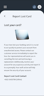
Then I found out that I missed out the live chat page in customer support. Other than providing live chat support, I created a small box that displays frequent asked questions (FAQ) that provides user convenient to just click on the question they may want to ask without typing all out.
Lastly, I added some charts presenting user's budget in the current
month. Charts provide a clear visual representation of data,
making it easier for users to understand their spending patterns and
financial status at a glance. The charts are made in Canva.
Final High-Fidelity App Design Prototype
PBe doesn't allow user to screenshot / screen record so there is no original version of using PBe for comparison.
Fig 5.1. Video Walkthrough High Fidelity Prototype: Public Bank Engage

|
| Fig 5.2. Log in and Home Page |

|
| Fig 5.3. Notifications |

|
| Fig 5.4. Side Navigation Bar |

|
| Fig 5.5. Account Management |

|
| Fig 5.6. Account Security |

|
| Fig 5.7. Payments and Transfer |

|
| Fig 5.8. Card Services |

|
| Fig 5.9. Financial Planning |

|
| Fig 5.10. Insurance Planning |

|
| Fig 5.11. International Banking |

|
| Fig 5.12. Loan Services |

|
| Fig 5.13. Customer Support |
Fig 5.14. Final High-Fidelity App Design Prototype - Figma
FEEDBACK
Week 14
Summarise the text in the notifications, it's too much. Visualise the
table from "Budgeting Tools" into a chart, and add a home button so
user can straightly go to the main page instead of always pressing the
previous button. Also, you can add a visualise card in the "Current
Account" and "Savings Account".
REFLECTIONS
Experience
The process involved synthesizing the knowledge and skills acquired throughout the course, allowing me to refine and integrate visual assets into a functional prototype. Experimenting with illustrations, images, and various features highlighted the importance of visual consistency and user-centered design. This hands-on approach significantly enhanced my understanding of design principles and their impact on user experience.
Observations
During the project, I observed that selecting appropriate visual elements and reducing text significantly improved the app's usability. Users responded well to the incorporation of visual cards and spending analysis charts, which made the app more intuitive and engaging. Additionally, feedback from peers and Mr. Zeon was invaluable in refining the design. The emphasis on visual hierarchy, clear imagery, and minimal text created a more streamlined and accessible interface, which was crucial for user satisfaction.
Findings
The key findings from this project underscored the critical role of user feedback in the design process. Implementing suggestions such as adding a home button and visualizing data not only enhanced functionality but also improved overall user experience. The project demonstrated that well-chosen visuals and clear, concise information are vital for effective communication and user engagement. Moving forward, these insights will guide future design endeavors, emphasizing the importance of continuous iteration and user-centered design practices.
FURTHER READING
Research Name: Branded Apps and Their Impact on Firm Value: A Design Perspective
Author: D. Eric Boyd, P. K. Kannan, and Rebecca J. Slotegraaf
- Firms are increasingly launching branded mobile apps to engage new and existing customers.
- Branded apps create multiple touchpoints during the customer journey (e.g., Starbucks app features).
- Limited research on the financial accountability of apps despite insights on app adoption and usage.
- Measuring profit impact is challenging due to customers using multiple devices and potential spillover effects from upper-purchase-funnel activities.
- No integrated research on whether branded mobile apps influence firm value.
- This research focuses on whether branded mobile apps create firm value using an event study on stock market returns.
- Stock market returns provide insight into branded mobile apps' financial accountability.
- Investors consider future revenue and costs of app development, creation, and marketing.
- The study examines how app design features influence firm value at launch.
- Customer interaction with brands through mobile media is continuously evolving.
- Data set of 455 branded mobile app launch announcements (2008-2014) shows app launches increase firm value.
- Higher stock market returns when app design emphasizes social-oriented touchpoints over transaction-oriented touchpoints.
- Value of app design elements shifts with changes in digital, social media, and mobile marketing eras.
- Findings illustrate branded mobile apps' accountability and contribute to omnichannel research.
- Provides recommendations for marketers on app design for greater accountability.
- Addresses the question of whether mobile apps justify the development and maintenance costs, often exceeding $2 million.
# Branded App Design Features
Firms design branded apps with various features to strengthen value and enhance customer engagement.
Features offer touchpoints at different customer journey stages.
Three Types of Features:
- Social-oriented features:
- Involve peer-to-peer interactions about a brand at any stage.
- Enable social media use, posting, and reading reviews.
- Example: TripAdvisor app for submitting and sorting reviews.
- Personal-oriented features:
- Facilitate interactions between customer and brand at any stage.
- Managed and controlled by the firm.
- Example: Barnes & Noble’s Tikatok app for creating e-books.
- Transaction-oriented features:
- Focus solely on the purchase phase.
- Facilitate purchase and offer promotions.
- Example: Walmart app for eValues, discounts, and easy reordering.
- Social-oriented features:
Expectations and Hypotheses:
- H1: Apps emphasizing social-oriented features increase firm value impact.
- Enhance engagement across the customer journey.
- Increase purchase consideration through social proof.
- Strengthen customer connection to the brand.
- Attract new customers via network effects.
- H2: Apps emphasizing personal-oriented features pose challenges.
- Limit benefits from peer-to-peer engagement.
- Reduce consumers' sense of social connectedness.
- Apps with utilitarian features see less usage.
- Social-oriented features offer higher future cash flows and stability.
- H3: Apps emphasizing transaction-oriented features may decrease firm value impact.
- Reinforce a single phase of the customer journey.
- Increase risks of substitution and cannibalization.
- May displace revenue from existing channels without increasing cash flows.
- Integration with multiple channels can mitigate risks and enhance value.
- H1: Apps emphasizing social-oriented features increase firm value impact.


Comments
Post a Comment