Application Design I - Task 3: Lo-Fi App Design Prototype

Tan Zhao Yi / 0363285
Application Design I / Bachelor of Design (Honours) in Creative Media
Task 3 / Lo-Fi App Design Prototype
LIST
Lectures
Lecture 1-8 refer to Task 1 and Task 2.
Task 3: Lo-Fi App Design Prototype
INSTRUCTION
LECTURES
Lecture 9: Wireframe and UI Kit
Wireframe
- Two-dimensional blueprint and visual guide that represents the skeletal framework of a mobile application.
- Visually illustrate different steps in the user journey as a way to identify potential pain points before the dev team starts building.
- Provides a clear overview of the page structure, layout, information architecture, user flow, functionality, and intended behaviours.
- Do not include any colours, stylised graphics, images, logos, fonts, or mobile app design elements. They’re simply early sketches that show how the app will be used.
TIPS: Make it simple, maintain style consistency, and information
hierarchy!

|
| Example of Wireframes |
UI Kit
- Pre-packaged collection of all UI components for a mobile app or website.
- With a UI kit, designers don’t need to create every design component from scratch.
- Many UI kits can be used as templates for niche-specific use cases. (e.g. all e-commerce apps should have a similar user interface, so a designer can use an e-commerce UI kit or wireframe kit as a starting point and then customise the interface from there. )
- UI design has a massive impact on how much time users spend in an app. If the app is well designed, easy to navigate, and responsive, users are less likely to churn or uninstall the app.

Usability heuristics are general principles or guidelines that
designers and usability experts use to evaluate and improve the
user-friendliness and overall usability of products, such as websites
and applications. These heuristics serve as rules of thumb to ensure a
positive user experience.
1. Visibility of System Status
- A system should provide consistent feedback to users about its current state.
- This allows users to see the system's status and understand its current state.
- Immediate feedback on user actions is essential.
- Predictability and control are important for users.
- More information generally leads to better decision-making.

- Design interfaces to align with users' real-world experiences and expectations.
- Use familiar concepts, language, and conventions for a seamless, intuitive experience.
- Visual metaphors: Icons/images representing real-world objects (e.g., trash can for deleting files).
- Use familiar language: Employ words, phrases, and concepts users recognize.


3. User Control and Freedom
- Ensure users feel in control of the interface.
- Provide flexibility to undo or redo actions.
-
Good practices:
- Allow users to go back a step.
- Meet users' expectations when using a back link.
- Allow users to easily cancel an action.
- Provide a "Close" link to dismiss new views.
- Support undo functionality.

|
| Undo Functionality |
4. Consistency and Standards
- Maintain uniformity and predictability throughout the user interface.
- Use consistent design elements, patterns, and behaviors across the system.
- Visual Consistency: Consistent colors, typography, icons, and layout.
- Functional Consistency: Similar actions behave the same way across the system.
- Feedback Consistency: Consistent feedback for user actions (e.g., success messages, error notifications, loading indicators).

|
| Web Consistency and Standards |
5. Error Prevention
- Design interfaces to reduce user mistakes and provide error correction mechanisms.
-
Key strategies include:
- Clear Instructions: Provide concise guidance for tasks.
- Confirmation Prompts: Ask for confirmation before irreversible actions (e.g., deleting a file, making a purchase).
- Validation: Check user inputs in real-time (e.g., password strength indicators, email format validation).

- Design interfaces to help users recognize information rather than recall it from memory.
-
This reduces cognitive load and enhances user-friendliness.
- Menu Navigation: Provide clear, accessible navigation menus or icons for easy recognition and access to features.
- History and Favorites: Allow users to access recently used items or mark favorites to avoid remembering specific details or locations.

- Design interfaces to cater to both novice and experienced users.
-
Allow users to accomplish tasks according to their expertise and
preferences.
- Customization: Enable personalization of interface settings (e.g., preferred shortcuts, layout configurations).
- Shortcuts: Provide advanced users with shortcuts or features to streamline tasks and enhance efficiency.
- Adaptability: Create interfaces that adjust to user proficiency, offering simpler or more detailed options based on experience.

|
| Flexibility and Efficiency of Use |
8. Aesthetic and Minimalist Design
- Simplicity: Include only essential elements and features that enhance user experience and functionality.
- Visual Hierarchy: Organize content to naturally and intuitively guide users' attention.
- Whitespace: Use ample whitespace to create breathing room between elements, enhancing readability and visual clarity.
- Consistent Typography and Colors: Use a harmonious palette and consistent typography for a cohesive visual identity.

- Clear Error Messages: Provide specific, understandable messages explaining the issue and suggesting fixes.
- Visual Cues: Use icons or color coding to highlight errors and direct attention to areas needing correction.
- Guided Recovery Paths: Offer step-by-step instructions or links to help pages for resolving errors and continuing tasks.

- Contextual Help: Offer tooltips, hints, or on-screen guidance during interactions.
- User Guides and Tutorials: Provide documentation, tutorials, or walkthroughs explaining system features and functionalities.
- Searchable Knowledge Base: Offer a searchable database of articles, FAQs, and troubleshooting guides for common issues.
- Online Support: Provide access to customer support, forums, or community resources for questions and assistance.

User Interface Visual Elements: Line, Shape, Color, Form, Texture, and
Space.
Task 3: Lo-Fi App Design Prototype
A. Wireframe
I work on my low fidelity prototype in Figma. This has been a tiring process, but it gives me a great sense of
accomplishment because I can see how I created my application from
scratch.

|
| Fig 1.1. Designing Interface |
After I drew out all the interface, I started working on the
buttons. I looked for some tutorial videos from YouTube.
Fig 1.2. Hover Effect in Figma
I copied the button created and create a component and added a
variant for the hover effect. Choosing "While pressing" in the
interactions, the button will change its presentation while user
press the button.

|
| Fig 1.3. Creating Components in Figma |
Other than that, in the "Prototype" session, I connect all the
buttons, pages, and menus. There's a total of 10 flows in the
redesigned application.

|
|
Fig 1.4. App Flow |
In some of the pages like exchange rate info and insurance plan
info, there is too much content and it exceeds the frame. Thus, I
want to make it scrollable:
1. Select the intended scrollable content and group them.
2. Right click and select "Frame Selection".
3. Drag the box to the frame size.
4. In the "Prototype" session, make it scrollable and adjust the
overflow to "Vertical".

|
| Fig 1.5. Scroll Behaviour |
B. UI Kit
Based on the lecture given, the UI Kit will include:
1. Brand Logo
2. Brand Colour
3. Colour Palette
4. Typography
5. Iconography
6. Grid System
i) Colours
The brand colour and redesigned colour palette are decided by using
color shades and tints finder in
ArtyClick Colors.

|
| Fig 2.1. ArtyClick Colours |
I've chosen Mukta Mahee as the application's font because its
characteristic of sans-serif is suitable for a formal official
banking app.

|
| Fig 2.2. Serif vs Sans-Serif |
iii) Iconography
I chose the icons from Figma: Icons in Figma
The sizes are varied due to different artist and usage, as some
are used as a logo, and some are small icons. However, all of them
are outline icons.

|
| Fig 2.3. Outline vs Solid icons |
iv) Grid System
I did this after I finished my refined prototype. I realised that
this part is very important in order to maintain the layout
consistency. I complete this by referring the auto layout in
Figma.

|
| Fig 2.4. Auto Layout in Figma |
Final UI Kit
Finally, I compiled all the UI information in Canva.
Link:
UI Kit
In this session, I've created three scenarios with detailed
instructions and invited three users to finish their tasks. After
giving the instruction, I asked them to screen record their
performance for reference.
Scenario 1: Checking Out you Spending Analysis
It's the end of the month, and you've decided to review your
spending habits to ensure you're staying within your budget. You
want to see a detailed breakdown of where your money went this
month, such as how much you spent on groceries, dining, and
entertainment. Open the PBe app and navigate to the financial
planning session, find the spending analysis section to view a
comprehensive report of your expenses. Take note of any patterns or
unexpected high expenses that you might need to address in the
future.
Fig 3.1. Screen Recording - Scenario 1
Feedback: The app's interface is highly accessible and user-friendly. For
example, functions such as transferring funds, financial planning,
and other features are organized according to user habits, making
them intuitive to use. The layout is cohesive, and the size and
placement of elements are synchronized, enhancing the overall user
experience.
Scenario 2: Transferring Funds to Friend and
Notifying the Recipient
Imagine you need to transfer funds to a friend's account who is
using PBe too to pay for your shared dinner bill. You want to
ensure the money reaches her promptly and notify them once the
transfer is complete. Open the PBe app and find the fund transfer option, enter your
friend's bank details, and specify the amount you owe. After
completing the transfer, use the app's notification feature to send
an email letting your friend know the money is on its way.
Fig 3.2. Screen Recording - Scenario 2
Feedback: Overall, the interface design is easy to
understand. navigation is clear and seamless. However, when I try
clicking on "Transfer to Other Bank", it's a bit laggy.
Scenario 3: Adjusting Card Transaction
Limits
You've recently had some large expenses and want to adjust
the transaction limit on your credit card to better control
your spending. Open the PBe app and navigate to the card
management section. Find the settings for transaction limits
and adjust the daily limit to a lower amount that suits your
new budget. Confirm the changes to ensure your new limits are
applied, helping you manage your finances more
effectively.
Fig 3.3. Screen Recording - Scenario 3
Feedback: When I first started using it, I couldn't find where it was. I had
to spend time clicking into each option to look. Also, I feel that
the font is a bit small/not clear enough; it could be bolded or made
larger. The spacing between lines could be increased as well. I
think it's too crowded, and sometimes I click the wrong option,
referring to Fig 3.4.

|
| Fig 3.4. Spacing Issue |
D. Improvements
I changed the colour of the main body because lighter colour
background increases readability. Also, it avoids confusion because banking app's
audience has a wide age range and traditionally older generations
tend to read black text on white paper.
I did some refining based on the feedback given from user testing.
First, I adjust the spacing of each content to remain the
consistency. I set it 32 px between headings and 18 px between
heading and body text. To make it simpler and faster, I discovered
the Auto Layout function and it helps me a lot.

|
| Fig 4.1. Adjusting Auto Layout |
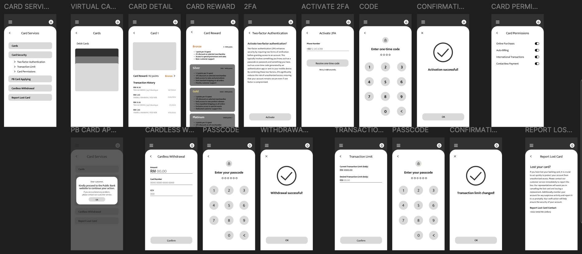
Then, focusing on the third user testing, I move the "Card Security" to the main menu of "Card Services" instead of putting it in each of the card.

|
| Fig 4.2. Card Services - before |

|
| Fig 4.3. Card Services - after |
Final Lo-Fi App Design Prototype
Fig 5.1. Video Walkthrough Low Fidelity Prototype: Public Bank Engage

|
| Fig 5.2. Log in and Home Page |

|
| Fig 5.3. Notifications |

|
| Fig 5.4. Side Navigation Bar |

|
| Fig 5.5. Account Management |

|
| Fig 5.6. Account Security |
|
| Fig 5.7. Card Services |

|
| Fig 5.8. Customer Support |

|
| Fig 5.9. Financial Planning |

|
| Fig 5.10. Insurance Planning |

|
| Fig 5.11. International Banking |

|
| Fig 5.12. Loan Services |
|
| Fig 5.13. Payments and Transfer |
Figma Link: https://www.figma.com/design/zvjAPPQdIlQALuWLxm4Lsm/PBe-Wireframes?node-id=266-1107&t=TdHak8P9gnnyUb4i-1
Fig 5.14. Final Lo-Fi App Design Prototype - Figma
FEEDBACK
Week 12
I've reviewed it and didn't find any major problems. I'll
provide comments in person when we meet. Good effort, and
don't forget your UI kit.
Week 13
Good effort but all I can see is icons and text, maybe you can
add some more illustration and graphics.
Week 14
Summarise the text in the notifications, it's too much. Visualise
the table from "Budgeting Tools" into a chart, and add a home
button so user can straightly go to the main page instead of
always pressing the previous button. Also, you can add a visualise
card in the "Current Account" and "Savings Account".
REFLECTIONS
Experience
The process of sketching out basic layouts and wireframes
provided a solid foundation to explore different ideas quickly
and effectively. By focusing on simplicity and functionality, I
was able to iterate on my designs without getting bogged down by
visual details, ensuring that the core user experience was
prioritized.
Observations
Throughout the prototyping sessions, I observed that users
responded positively to intuitive and straightforward navigation.
Clear labeling and logical flow between screens were critical in
helping users accomplish their tasks efficiently. However, it was
evident that certain areas needed improvement, such as the clarity
of some icons and the balancing between text and
images/illustrations. Feedback from user testing session
highlighted the importance of having a consistent and predictable
interface, which reinforced the need for a user-centered design
approach.
Findings
The primary findings from this low fidelity prototype exercise
underscored the significance of user feedback in the design
process. Users appreciated a minimalist design that did not
overwhelm them with information or options. It became clear that
visual hierarchy and the strategic use of whitespace greatly
enhance usability. Additionally, the need for accessible design
emerged as a crucial factor, emphasizing that all users,
regardless of their abilities, should have a seamless experience.
These insights will be invaluable as I move forward with refining
the prototype into a more detailed and polished design.
FURTHER READING

Book Name: Designing Apps for Success :
Developing Consistent App Design Practices
Author: Matthew David and Chris Murman
E-book Link: https://ebookcentral-proquest-com.ezproxy.taylors.edu.my/lib/taylors/reader.action?docID=1613755
Section 1: Designing Apps to Work
The mobile revolution has transformed daily life, integrating
technology seamlessly. Devices like smartphones and tablets
serve multiple functions, with constant use throughout the
day. The pivotal change wasn't just the iPhone's arrival but
the introduction of Apple's App Store, which redefined content
consumption. This shift underscores technology's pervasive
presence in modern life.
-
Key Reasons for Success of App Usage:
- One-click install, no need for legalese.
- Touch interface is intuitive.
- Screen limitations force developers to prioritize essential features.
#Defining How Mobility Drives Additional Business
- Consultant Joke: Advocates for mobile-first without addressing business fundamentals.
- Key Message: We live in a business-first world, not mobile-first.
- Mobile as Technology: Engaging but not the core driver of business.
-
Forrester's POST Definition:
- P— People
- O— Objectives
- S— Strategy
- T— Technology (last step)
- Business Focus: Understand business types, objectives, and client engagement to see how technology, like mobile, supports them.
Small-business Mobility Business Opportunity
- Small-Business Owner vs. Sole Owner: Both focus on business essentials, but small-business owners deal with more people, work, and money.
- Role of Mobility: Enhances focus, location awareness, and technology use.
-
Examples:
- Realty Agents: Manage emails, post photos, schedule meetings from a phone.
- Restaurant Owners: Use tablets for ordering to improve customer experience.
- Package Delivery Managers: Use GPS for location tracking and smartphones for client signatures.

|
| Mobile device management seeks to address three key things about your mobile assets: enforcing policy, knowing where you asset is, and securing data on the device. |
Large-scale Mobility Solutions for Enterprises
- Enterprise Challenges: Employee count, project size, diversity, technologies.
-
Three Key Objectives:
- Deliver customer value (products/services).
- Improve employee efficiencies.
- Speed up partner channel throughput.
- Role of Technology: Process and goals remain the same; technology increases velocity.
-
Example - Dole App:
- Captures data points and photos of inspected fruit.
- Submits data to HQ, consolidating automatically.
- Reduced decision-making time from ten days to one.
- Impact: Significant improvement in operational efficiency.
Comments
Post a Comment